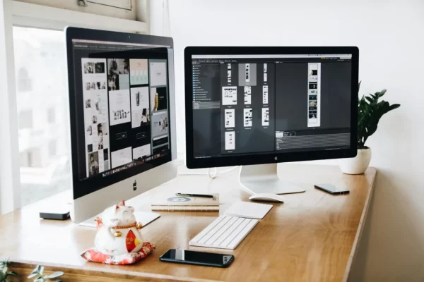
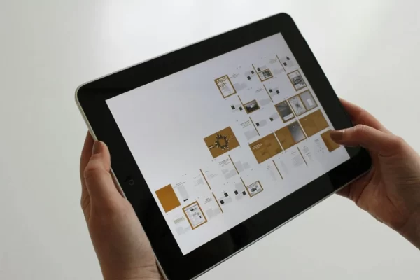
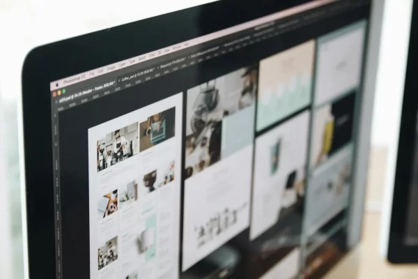
The world of web design is constantly evolving, driven by user behaviour and engagement. The web design landscape undergoes continuous transformation to establish a strong brand position, meet the target audience’s changing needs, and stand out from the competition. From brief and innovative solutions to enduring and strategic techniques, the field is in constant flux, providing ample opportunities for those seeking to fortify brand value and infuse excitement into their digital presence.
Web design trends in 2024 are shifting towards more immersive and personalised experiences. Designers harness cutting-edge technologies such as AI and machine learning to craft dynamic, user-centric websites that seamlessly adapt to real-time user preferences and behaviours. This paradigm shift ushers in a new era of interactive design, transforming websites from mere viewership platforms to engaging experiences, offering distinct journeys tailored for each visitor.
To understand the evolution of web design over time and explore the current trends in 2024, let’s look at the reasons influencing the industry’s growth. This exploration will shed light on the changes poised to reshape the website landscape, pointing to future web projects in the right direction.
Current Trends in Web Design for 2024
Here are some top web design trends expected to dominate the market and influence web design experts this year:
Oversized Text
Incorporating large or oversized text throughout various sections is a key strategy for a website aspiring to exude ultra-minimalist aesthetics while effectively conveying essential information at a glance. Beyond the primary headline above the fold, consider employing thick and bold headings to spotlight services, bestselling products, or crucial contact details.
The use of plain text with sans serif font styles contributes to the website’s visual appeal, offering a clean and modern look. This deliberate choice of presenting information in sizable text not only enhances the website’s responsiveness but also enables designers to maintain a minimal layout by eschewing large visuals.
Y2K Effects
Nostalgia is experiencing a robust resurgence in the visual landscape of the 2020s, with designers enthusiastically embracing elements reminiscent of the late ’90s and Y2K era. From the revival of oversized text to the incorporation of retro illustrations, a wave of Y2K-inspired graphics is set to dominate web design in the coming year. Anticipate the revival of static noise in background imagery, vibrant neon colours, and matrix-style text as these elements gain popularity.
The profound emotional connection people have with nostalgic design is evident, and it’s no wonder that Y2K aesthetics are becoming increasingly prevalent in branding. These nostalgic effects are not confined to personal expression but are finding practical applications in business websites, particularly in marketing, design services, and portfolios.
UX-Focused Design
The current web design landscape is witnessing a pronounced emphasis on User Experience (UX), and this focus is anticipated to intensify in the coming year. Designers are actively striving to craft immersive experiences that resonate with users, recognising that the journey toward lead generation, increased traffic, and conversions hinges on catering to visitors’ needs and preferences. Every element on a website, from the navigation bar to the hero image, animations, videos, and text, is meticulously structured to engage users within the first few seconds. The overarching goal is to present direct information on the homepage, immediately communicate the business’s offerings, and outline how it can solve potential customers’ problems.
In this user-centred design approach, businesses are adept at discerning the needs and preferences of their customers, paving the way for creating personalised experiences. Integrating AI-powered platforms is becoming increasingly prevalent, streamlining navigation and providing instant recommendations or solutions.
Vibrant Gradients
The resurgence of gradients in logo design initiated by Instagram marked the inception of a noteworthy trend. Graphic designers and brands keenly observed the positive impact and public response to the new app icon, prompting the realisation that gradients could significantly enhance the visual appeal of websites, imagery, and logos.
Integrating gradient accents, whether in black and white or vibrant tones, can be a compelling choice for those starting to create a new website or revamp an existing one. Elevating Calls to Action (CTAs) with striking gradients or employing them in the background for images or entire sections, especially with a more prominent colour palette, introduces a dynamic visual element that breaks traditional white space. The versatility of gradients extends beyond aesthetics, proving particularly effective in enhancing the visual allure of SaaS websites and e-commerce platforms. Gradients can spotlight essential messages, serve as prompts for user interaction and play a pivotal role in sustaining visitor engagement by encouraging further exploration.
Motion Effects On The Home Page
Unquestionably making waves in the web design industry, one prominent trend captivating designers and audiences alike is the integration of motion effects. Anticipated to secure a position among the top trends this year, this dynamic approach promises to usher in immersive experiences for website visitors. The evolving landscape of motion effects on home pages encompasses various forms, with scroll-driven animations taking the lead, not only guiding users seamlessly through the content but also directing attention to the offerings of businesses or services.
Here are a few other ways to add motion effects on the home page:
- Hover animation
- Loading animation
- Accent animation
- Moving elements
When implementing moving effects, a wise consideration is paramount to ensure a seamless user experience, particularly about speed and mobile display. Striking a balance is crucial, as excess effects can confuse or overwhelm users visually. This trend can inspire websites offering design services and SaaS products, as animations on the home page enhance the overall appeal of these platforms, fostering interactivity and a more engaging experience for visitors.
Interactive Storytelling
In the world of web design in 2024, storytelling takes centre stage, requiring designers to delve deep into their toolkits to captivate audiences. While storytelling has already become a pervasive trend, its continued relevance stems from the need for designers to innovate. By infusing interactivity into storytelling, designers can forge a unique brand identity and voice within the highly competitive digital arena, compelling audiences to stay engaged and immersed in the narrative.
The rising prominence of interactive storytelling lies in its ability to seamlessly guide visitors through a narrative without disrupting the flow of information. Incorporating elements such as gamification, videos, and immersive 3D visuals enables the creation of unforgettable user experiences on websites. However, it’s important to note that interactive storytelling doesn’t necessitate grand gestures – even simple animations with two or three visuals or dynamic text can effectively contribute to this trend.
Glassmorphism For The Hero Section
When landing on a website, the initial focal point often gravitates towards the hero image, occupying the prominent space above the screen. Elevating this crucial element to stand out and resonate uniquely with the audience is where the emerging trend of Glassmorphism comes into play. Characterised by the application of transparency to create a glass-like aesthetic, it is now gaining considerable traction and is poised to be a dominant force in web design throughout 2024. Leveraging it in the hero section has the potential to command attention, compelling visitors to pause and engage with the conveyed message or showcased product.
The allure of Glassmorphism lies in its ability to entice users to explore further, generating interest in the business or brand by presenting aesthetically pleasing images or shapes. Despite its sophisticated appearance, it simplifies the design process for professionals, proving versatile enough to integrate seamlessly across diverse industries while adhering to the principles of minimalism.
Clear Or Visible Borders
One of the most important web design trends for 2024 is improving structure clarity to streamline navigation and boost responsiveness. The future landscape indicates a significant increase in the usage of clear borders, particularly around large photographs and product photos, which effectively improve user experience with few changes to the overall website design.
The allure of this trend lies in its simplicity, positioning it as a ubiquitous and influential element to monitor in the upcoming year. Expect an influx of websites embracing visible and distinct borders, strategically delineating sections on home pages or framing text. The versatility of clear borders becomes apparent, allowing for creative integration in web design to accentuate bestselling products or essential details.
Dynamic Typography
Kinetic or moving typography is a new trend in web design that uses animated text to capture users rapidly. Already gaining popularity among designers and brands, kinetic typography proves to be a dynamic and engaging style positioned to impact web design significantly.
Functions as the potential hero of a website, kinetic typography can stand alone on the homepage, utilising moving text for headlines or subheadings to keep users engaged without cluttering the space. This trend offers a unique advantage by avoiding the need to fill spaces with additional visuals or shapes, contributing to a streamlined browsing experience. Not only does kinetic typography maintain website speed, but it also presents an aesthetically pleasing display on mobile devices.
Why Web Design Trends Matter
Web design trends play an important role in increasing user engagement and creating memorable experiences. Following the current trends enables designers and developers to:
Maintain Relevance
Websites that look to be out of date may turn off visitors and undermine a brand’s credibility. Adopting current design trends demonstrates that your website is up-to-date and relevant.
Improve User Experience
Many design trends are centred on improving user experiences, making navigation simple, and content consumption delightful. Prioritising user experience can lead to higher conversion rates and customer satisfaction.
Stay Competitive
Standing out from the crowd is critical in today’s competitive online market. Incorporating unique design features can help set your website apart from others in your sector.
Update Your Website Today!
The influence of web design trends extends far beyond mere aesthetics, shaping how users perceive and engage with websites. Keeping abreast of the latest design trends transcends mere fashion-following; it is a strategic endeavour to deliver unparalleled user experiences and secure a competitive advantage in the digital landscape. To create innovative and visually striking websites that leave an indelible mark on the audience, it is crucial to not only embrace the right trends but also foster a sense of curiosity and a commitment to continuous learning.
Stay ahead in the digital landscape by ensuring your website is not only up to date but also seamlessly incorporates the latest trends. Our expert team at Digital Rescue specialises in crafting cutting-edge websites that capture attention and elevate user experiences. Trust us to bring your vision to life while safeguarding your website’s overall performance. Don’t just keep up; lead the way with Digital Rescue. Contact us now to transform your digital presence.


