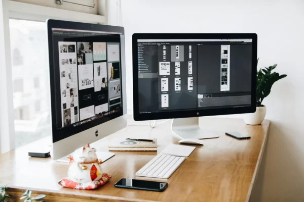
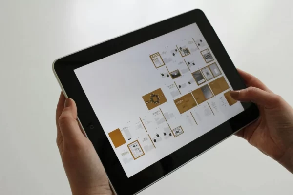
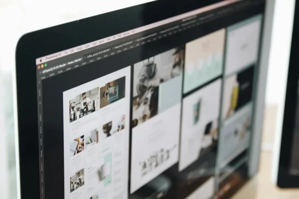
Whether the web designers put structured effort behind a website’s development process or not is the primary factor behind its resulting success or failure. A good web design isn’t only aesthetically pleasing but also user-friendly. Simply put, it can be a make-or-break standpoint for your company in terms of moving forward and why lacking in any aspect whatsoever can demolish your brand’s online presence on the go.
Moreover, the basic principles of a good web design are not limited to how the website looks or feels to the user. While these two factors play a crucial role in web development, your site’s internal working eventually surpasses every other aspect. Here are eight attributes contributing to a well-structured website layout that also work as excellent conversion-boosting tactics:
- Landing Focus
The first thing users see upon entering any website is its landing page, whose purpose is to inform and accommodate them by stating the given business’ clear intentions. It is understandable how each website’s focal point differs from one another.
For example, your website may impart practical wisdom consisting of guideposts, sell a product or service to customers, or even cover entertainment, fashion, or sport sector news. Nevertheless, while the website’s outward purposes seem to be different, its core values remain the same. That is, keeping your landing content simple, to the point, and easy to understand. Neglecting this factor means dismissing the user experience and losing your potential clients before they are even given a chance to explore and look around.
- Colour Palette, Typography, and Imagery
Simplicity is the best route to take when enhancing the user experience. That’s why professionals keep three concepts in their focus when designing any webpage – colour palette, typography, and imagery. Here’s how these factors come into play for developing an adequate web layout:
Colour Palette – Colours have an intricate power to relay messages and evoke emotional responses from human beings. For example, white and green seem to be prominent colours when it comes to gardening websites. Similarly, yellow, green, orange, and blue are often the keynotes we notice upon entering an interior design website. Colours have a way to speak with the user on a level that words never can. However, the number of colours used should be kept at less than five on a given page to maximise customer engagement while making the user feel good.
Typography – The typography used on a site also plays an essential role in elevating user experience. Clean and clear fonts command a user’s attention, while messy fonts trigger the readers into ditching the content. While some typefaces may look unique to you, customers want as much simplicity when they cruise through your website as possible. That said, three typefaces are the maximum limit to use on a single webpage.
Imagery – By imagery, we mean any visual means of communication, including illustrations, photography, and videos. Most of the initial information consumed on any webpage is visual-based, which is why it’s best to make sure each image is processed in high definition to leave a sense of credibility in the visitor’s minds.
- Simple-to-Cruise Navigation
The navigation panel is where the potential clients interact with the website to find what they are looking for. If your navigation system isn’t designed properly, it creates confusion for the users, compelling them to search elsewhere. That’s why keeping your website easy to navigate and intuitive is the next fundamental principle of a good web design.
- Visual Hierarchy
Visual hierarchy means the physical arrangement of elements on a screen such that you establish focal points in ascending order, using text size, imagery, and colour theme to your advantage. While several websites ignore this aspect of web designing, those that do get a competitive edge over others. Ultimately, integrating this basic principle makes it easier for the clients to access the most relevant information on a website without causing any excessive effort.
- Design and Layout
Grids and bars make it easier for you to keep things organised, be it listing your products, blog posts, news articles, or anything else. Giving your website a clean and rigid structure balances the overall look, encouraging the users to go through the data you’re providing them in an aesthetically pleasing manner.
- SEO-Based Content
A practical and catchy website has got a great design as well as content. Using compelling headlines and creating engaging content influences potential clients to turn into customers when combined with a mesmerising design and structure.
- Load Time
In general, people don’t like to wait for a given website, especially when they aren’t familiar with your business and are scrolling through your website for the first time. Nearly half of the users expect a website to load in under two seconds, and almost all of them leave the page that doesn’t finish loading within three to four seconds. Considering the given statistics, it’s best to optimise your page and images, helping it load faster.
- Web and Mobile-Friendly
Finally, it is essential to keep in mind the growing usage of smartphones, tablets, and phablets, when designing a website. Building a responsive layout for your website such that it readjusts itself to different screen sizes is another crucial principle of a good web design. It is also worth noticing that when a website doesn’t support screen compatibility for different devices, you lose several potential customers due to unwanted inconvenience.
By keeping the aforementioned eight principles of a good web design in your mind, you can create an aesthetic and highly-functional website without encountering any problem afterwards. Moreover, it may prove difficult for your website to go a long way when you ignore the aspects of usability and utility, focusing your hundred per cent on the visual design instead. The key is to strike the perfect balance between the different fundamental concepts to watch your website succeed and flourish in the real world.


